 BSlider: Customizing your Slider
|
 BSlider: Customizing your Slider
Derived from: public BControl
Declared in: be/interface/Slider.h
Library: libbe.so
Summary: more...
Creating a basic BSlider is very simple:
r.Set(5,5,255,55);
slider = new BSlider(r, "const:slider1", "Construct Speed (%)", NULL,
0, 140);
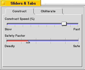
This creates a slider named "const:slider1" with the label "Construct Speed (%)" above it. The range of possible values for the slider is 0 to 140.
You can add a splash of color to the slider, too. For example, if you want the slider bar to be light blue, you might add:
slider->SetBarColor(color);
You can also add hash marks to the slider:
slider->SetHashMarks(B_HASH_MARKS_BOTTOM);
slider->SetHashMarkCount(10);
In this example, SetHashMarks() is used to specify that the hash marks should be below the slider; you can also specify B_HASH_MARKS_TOP to put them above the slider, B_HASH_MARKS_BOTH to put them both above and below the slider, and B_HASH_MARKS_NONE to omit them entirely (which is the default).
SetHashMarkCount() is called to indicate that you want 10 hash marks spaced evenly across the slider.
Finally, if you want to add labels at the ends of the slider, to indicate the minimum and maximum values, you can use the SetLimitLabels() function:
slider->SetLimitLabels("Slow", "Fast");
This sets the label for the minimum value (the left end of the slider) to "Slow" and the label for the maximum to "Fast".
The result is the "Construct Speed (%)" slider in the window pictures below. An example of a slider with the B_TRIANGLE_THUMB thumbType and hash marks above and below the slider is also shown.

You can customize the appearance of your BSlider by overriding virtual functions in the BSlider class that are responsible for drawing the slider bar, thumb, focus mark, and hash marks.For example, let's say you want your slider's thumb to be round. Just create a new class—let's call it CustomSlider—derived from BSlider, and override the DrawThumb() function with code that might look something like this:
const rgb_color kWhite = {255,255,255,255};
const rgb_color kWhiteGray = {235,235,235,255);
const rgb_color kDarkGray = {100,100,100,255};
const rgb_color kBlackColor = {0,0,0,255};
void CustomSlider::DrawThumb(void) {
BRect r;
BView *v;
// Get the frame rectangle of the thumb
// and the offscreen view.
r = ThumbFrame();
v = OffscreenView();
// Draw the black shadow
v->SetHighColor(kBlackColor);
r.top++;
r.left++;
v->StrokeEllipse(r);
// Draw the dark grey edge
v->SetHighColor(kDarkGray);
r.bottom--;
r.right--;
v->StrokeEllipse(r);
// Fill the inside of the thumb
v->SetHighColor(kWhiteGrayColor);
r.InsetBy(1,1);
v->FillEllipse(r);
}
All rendering of a BSlider is done into an offscreen view, which you can get a pointer to by calling the OffscreenView() function. This improves performance and makes drawing the slider—especially complicated ones—look much smoother to the user.
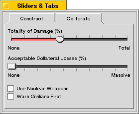
This code gets a pointer to the offscreen view, then renders a round, beveled thumb into the offscreen view, filling the thumb's frame rectangle as returned by the ThumbFrame() function.
The result is a round thumb that looks like the one in the "Totality of Damage" slider in the picture below:

|
Copyright © 2000 Be, Inc. All rights reserved..